There are animals on the streets! Well, not really - but there are a surprising number of “illegal” pets reported throughout the city. 1592 to be exact, since 2010. So what are these pets, and where are they?
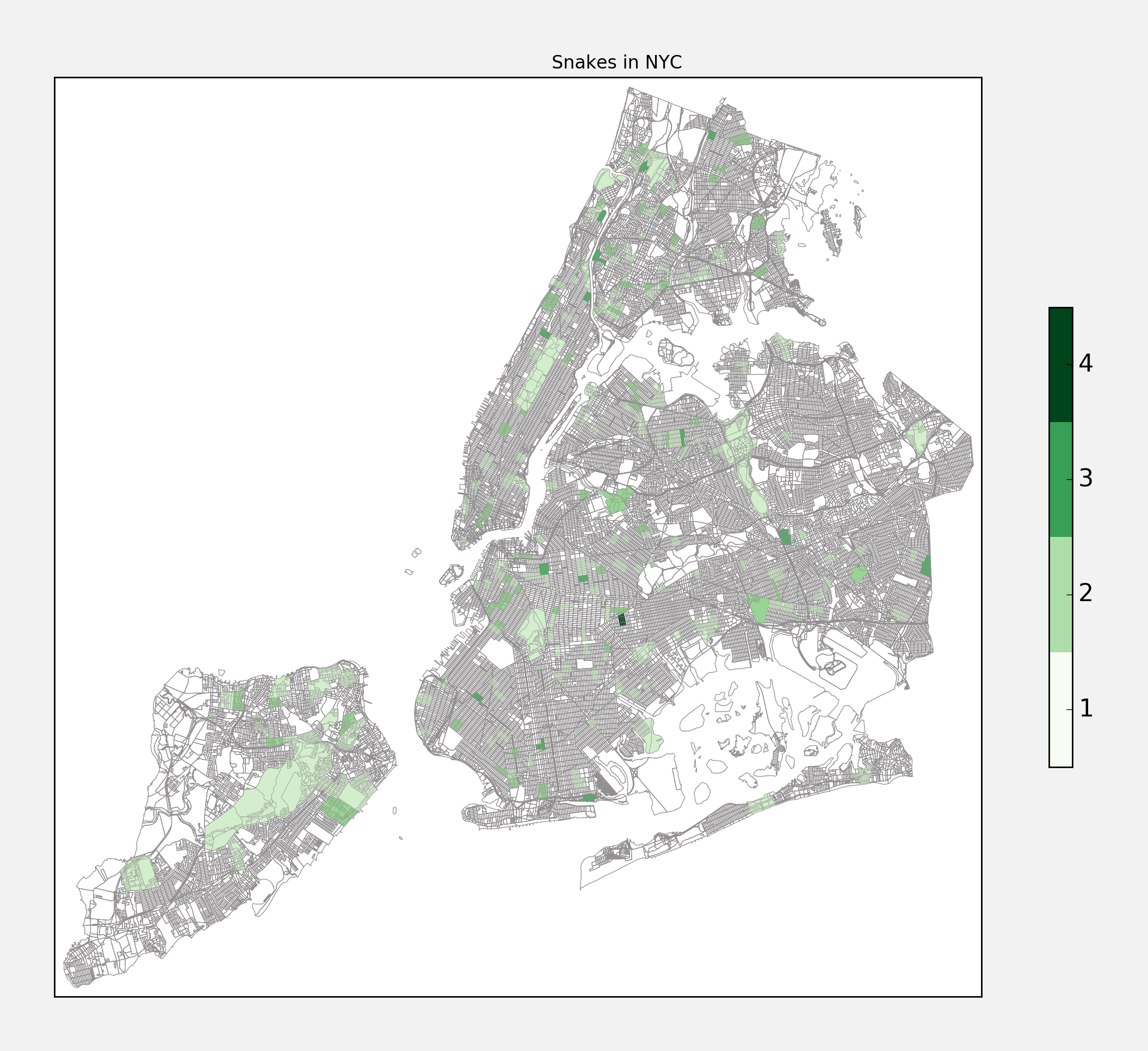
Number 3: Snakes
Apparently there have been 150 reports of snakes slithering about the city, accounting for about 9.4% of all the illegal pets. Ophiophobes might be a little distraught to see that they are fairly well distributed throughout the boroughs. I am overjoyed to see that several snakes have been reported in the area around the gowanus canal, near my home.
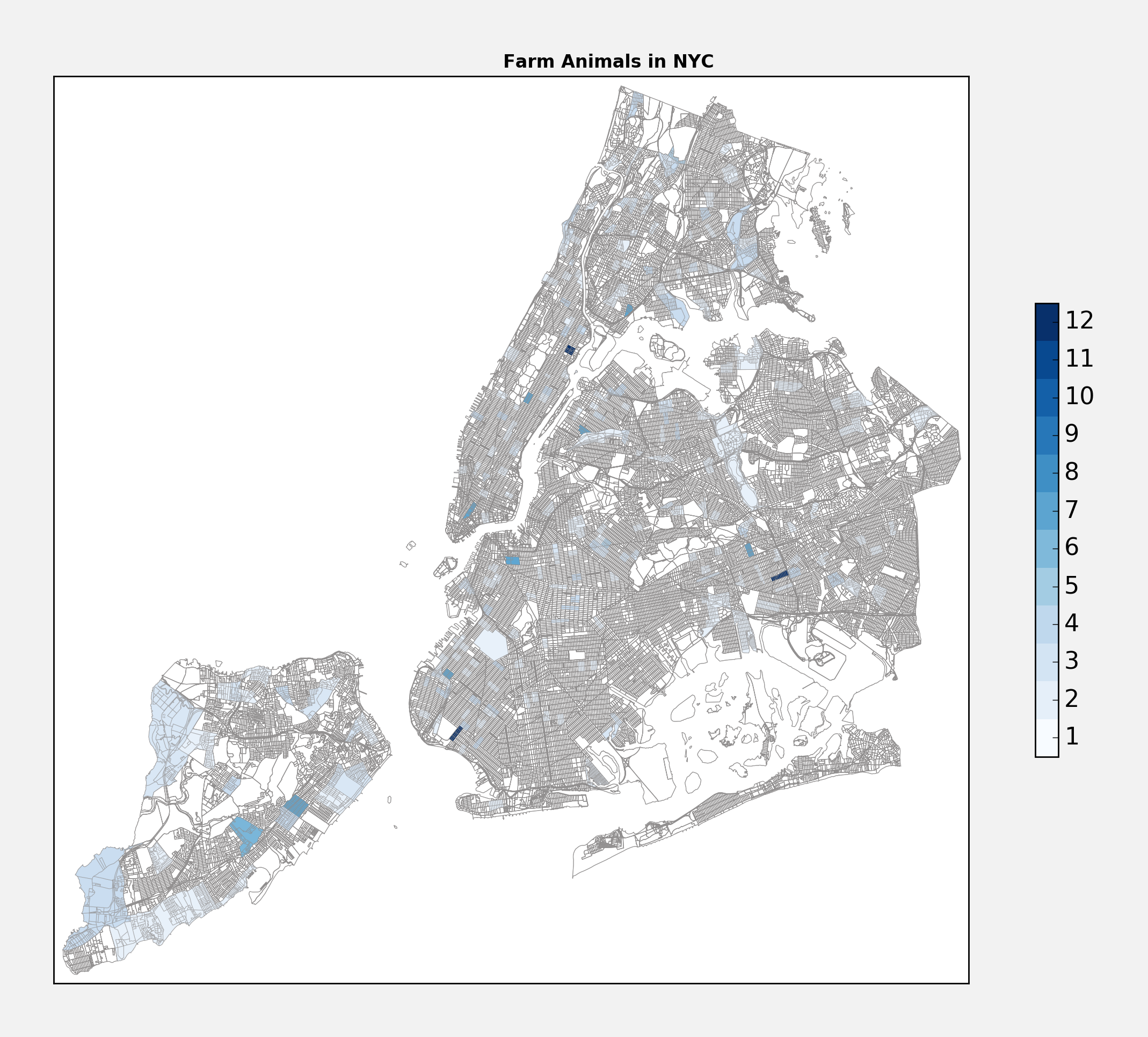
Number 2: Farm Animals
Narrowly beating out snakes, there have been 179 reports of “farm animals” around the city, or about 11.2% of all reports. Presumably this covers a wide range of animals - goats, sheep, cows maybe. There is a conspicuous concentration of reports filed around the Wall Street area - perhaps people are calling in the bull of Wall Street.
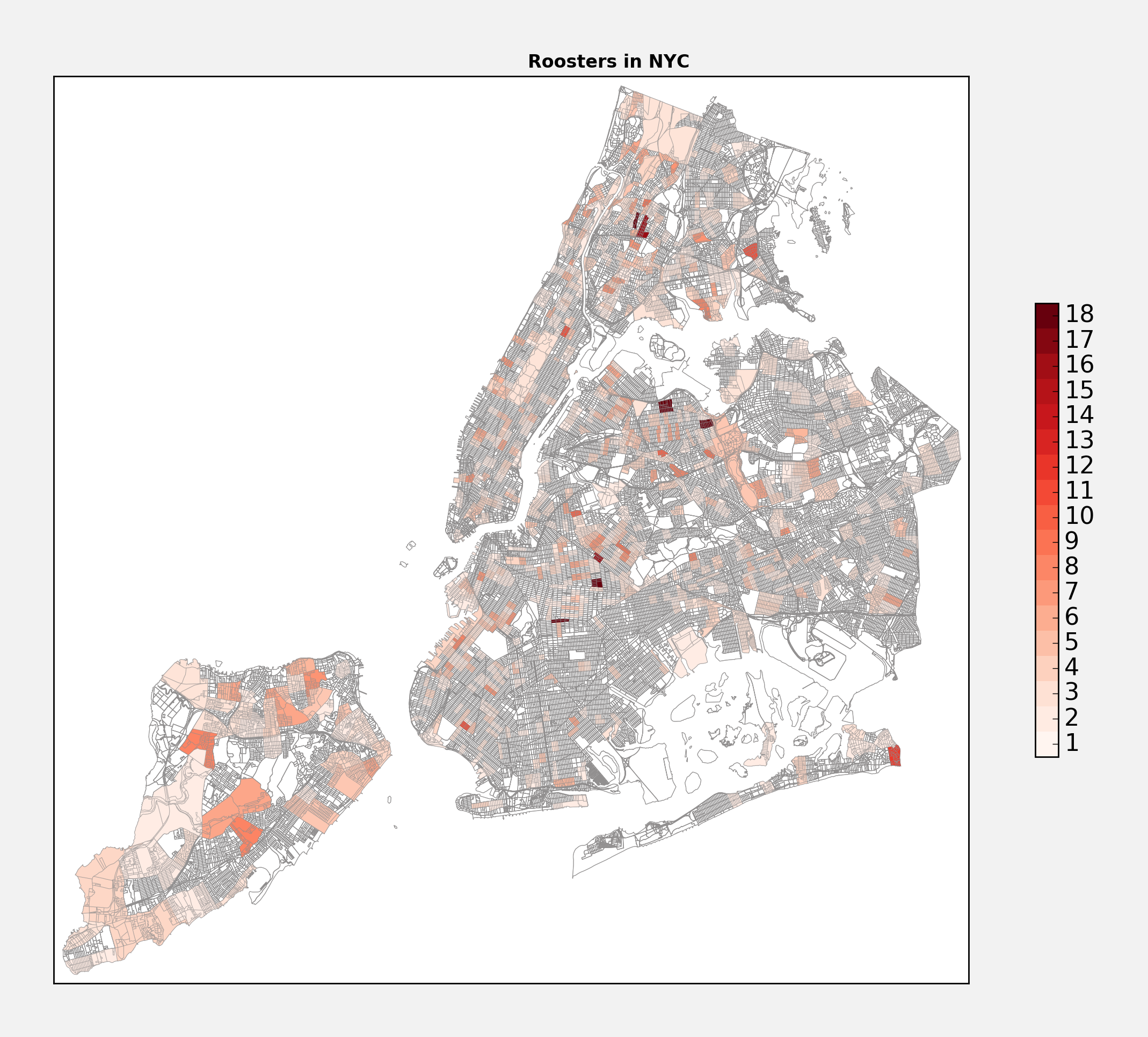
Number 1: Roosters!
Flying away with the lead, roosters have been behind 832 of the complaints, or about 52% of all illegal pet complaints in NYC. Roosters! Who would have thought… But, I suppose there is some selection bias afoot here. A secret pet goat might be easier to hide than a rooster who happily greets the day for all their neighbors to hear. Somewhat surprisingly, it looks like you can find them virtually everywhere in the city.
Honorable Mentions
There are other reported pets that did not make the top 3 - including a catchall category of “Other” that accounts for 359 (23%) of all the illegal pets. There are also 44 instances of ferrets, 16 instances of iguanas, 9 instances of monkeys, and 3 instances of turtles (specifically turtles under 4 inches long, illegal since they are a source of salmonella according to the FDA).
Who knew there was such an eclectic array of pets in NYC? I am a dog person, but if roosters are more your jam, looks like you are definitely not alone!